Background Bokeh: Top Right Corner at f4
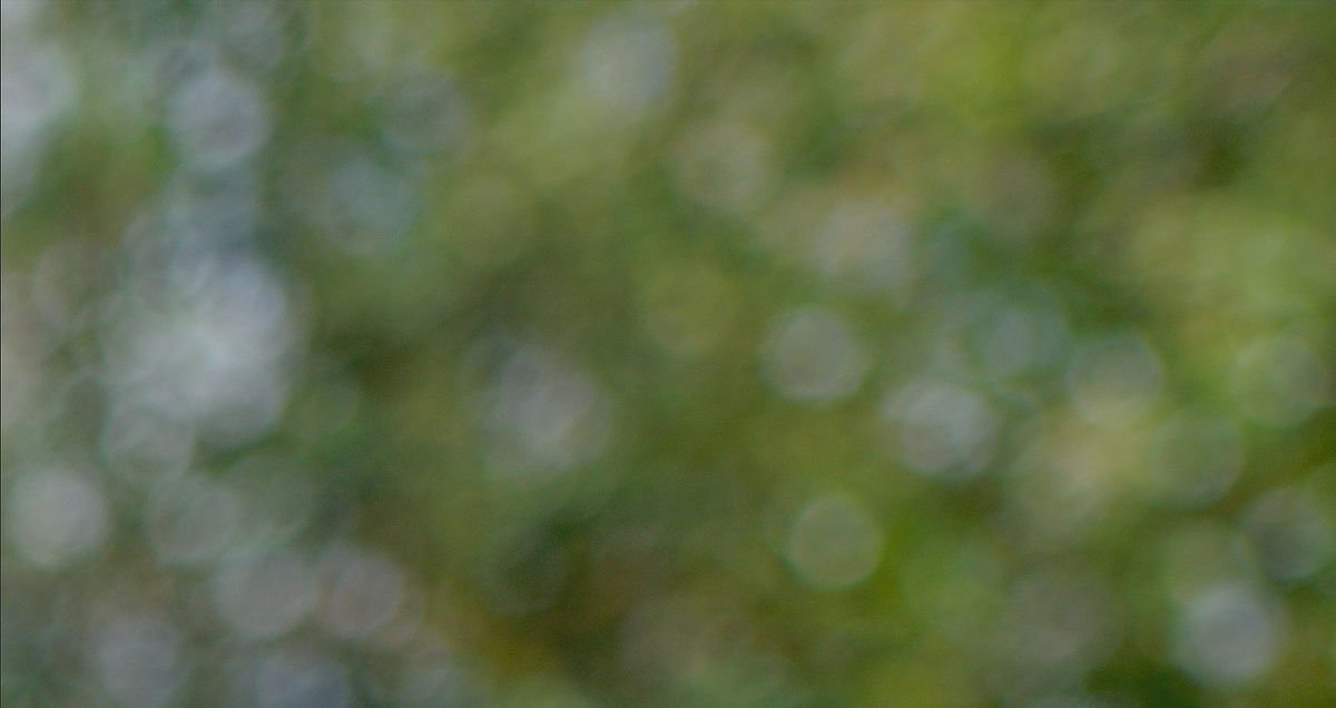

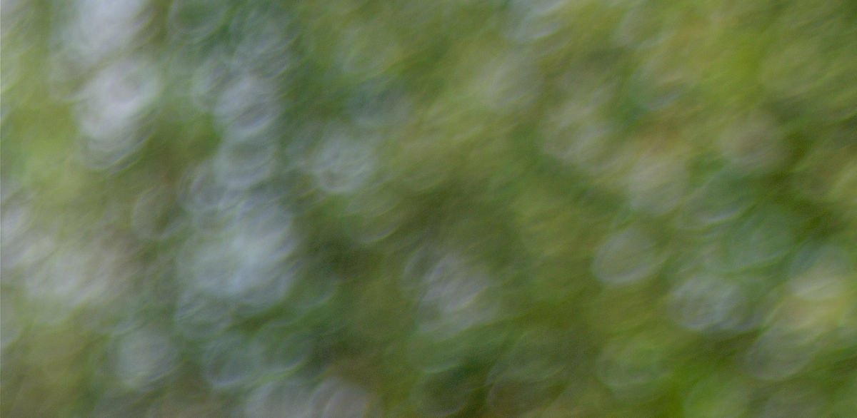
At this aperture (practically wide open), diaphragm shape is largely irrelevant: we’re seeing the bare mechanical and optical properties of each lens, here listed in order of preference.
Bokeh is less subjective than some suggest. We can speak of ‘correct’ bokeh as being free from distracting artefacts such as outlining, doubling or distortion, with gradual (or at least smooth) transitions around the focal plane. It becomes subjective – and a creative element in the toolbox – when we decide whether textbook clean bokeh is right for the image we want to make. Perhaps we want swirling, or soap bubbles, or hideous oval point sources (that’s right: anamorphic bokeh is the Devil’s work).
By that measure, the Pentax FA 35/3.5 renders this top right corner best – as a smooth collage of overlapping highlights. Because we’re shooting a small window into a big image circle, we wouldn’t expect mechanical vignetting to manifest as ‘cat eyes’, or radial oval distortion of highlights – and with the FA, we don’t. As we’ll see, through the image, the Pentax FA consistently delivers the least distracting bokeh.
Slightly ‘busier’ looking, the Olympus 35/2.8 Shift renders these defocused highlights (sunlight on tree leaves) as smaller circles, despite being shot at the same aperture (f4). There’s also some outlining.
Surprisingly, the A SMC 35/3.5 has riotously entertaining bokeh: strong mechanical vignetting is evident in centrifugally-distorted ‘bokeh balls’ rendered as soap-bubbles. This is a ‘statement’ look, introducing to defocused areas a tone of voice you may not intend.
Foreground Bokeh: Bottom left corner at f4


Background Bokeh: mid-frame at f4


The Pentax-A SMC 35/3.5 never looks less than ‘punchy’, with slightly stronger colour rendition than the FA 35/3.5. The Olympus images are consistently lower contrast. It’s the FA that has by far the best ‘classically correct’ bokeh of this trio – although the gap narrows between it and the Olympus 35/2.8 shift in the third set. It would be remiss if we didn’t acknowledge the bokeh potential of the Olympus’ extra stop. However, at an unfairly advantageous f2.8, the Olympus doesn’t ‘out-smooth’ the Pentax FA35 in all respects:
Olympus 35/2.8 Shift at f2.8



A useful lesson in quality over quantity: the degree of blur is naturally greater – which certainly flatters the Zone 1 sample – but the introduction of mechanical vignetting creates ‘edgier’ and more distorted bokeh in Zone 3 (the frame corners).
Let’s now examine the effect of aperture geometry at f8 . . .
Background bokeh: Zone 2 at f8



The disparity of rendering at wider apertures is somewhat homogenised at f8: in the bokeh, circles have been replaced by polygons.
One of the benefits of using a lens with a large image circle (apart from minimising mechanical and optical vignetting) is the ability to control the focal plane with tilt movements. For many shots, that will leave the bokeh-rendering properties of a lens on more prominent display. We hope it will be attractive . . .
Bokeh when tilted 10°: Zone 2/3 at f5.6


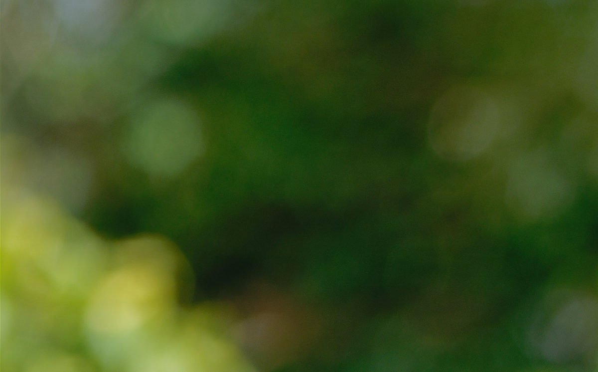
Tilting away from the top-right corner has pulverised the image, but not so completely that differences between the lenses are erased. Here at f5.6 we note the advantage of curved aperture blades, contributing to the smoothness of the Pentax FA 35 and Olympus 35 Shift.
Before moving on to night shots and bokeh fringing, let’s compare the whole frame with and without tilt movements:


